BCoT Maths
  • Home
  • FAQ
  • Trivia

What is a bar chart? 


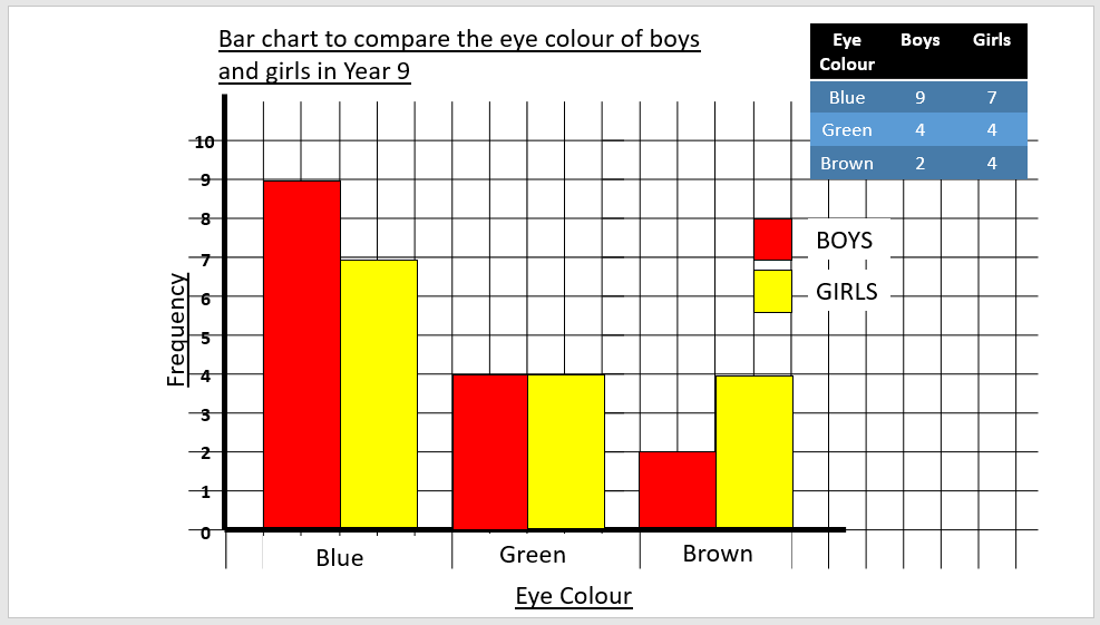
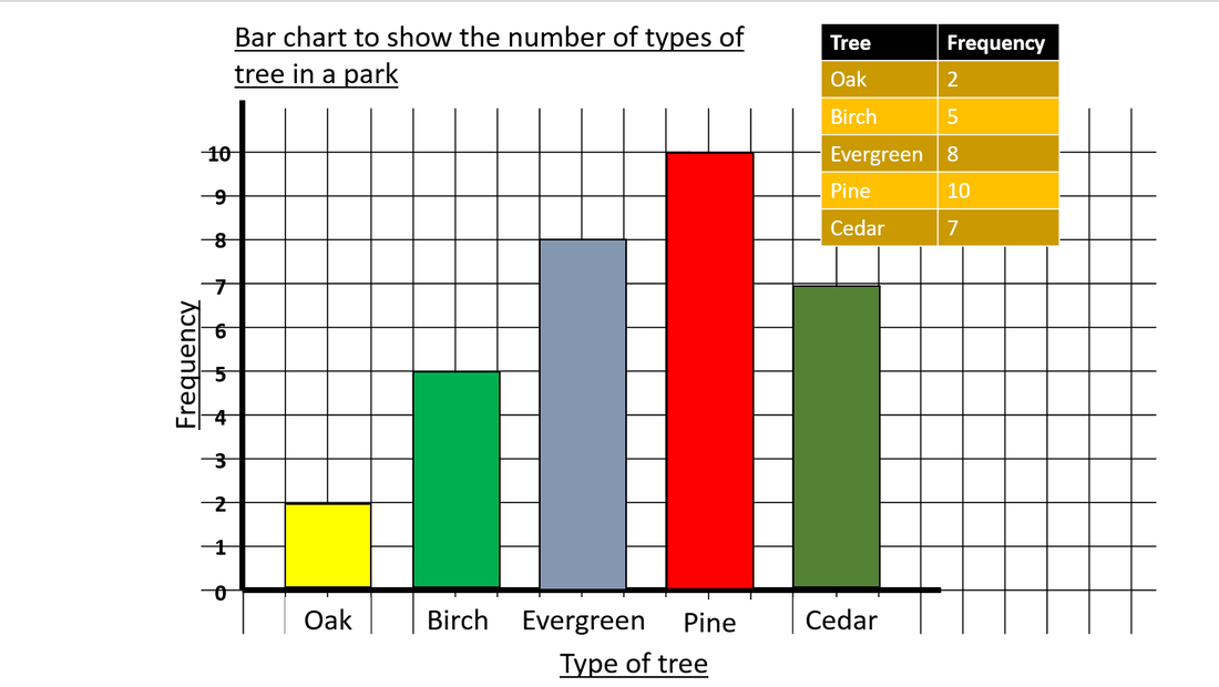
A bar chart is a chart to display data, usually as bars. A bar chart is one of the most common types of charts and is similar to a column chart. A bar chart must always have a title, frequency on the y-axis, gaps between the bars, bars with equal widths, and labelled axes. 

The image to the right shows a bar chart which visibly has a title, frequency on the y-axis, gaps between the bars, all bars are equal widths and both axes are labelled. You can also see the frequency data that goes along with the bar chart and gives it its data.

Usually in an exam, you'll be asked to work out the frequencies of different things so you can then plot them on a graph or chart. Don't worry, on this page, we are going to cover everything you need to know about bar charts.
Picture

Reading a bar graph


Reading a bar graph can be difficult if you are not confident or haven't seen a bar graph before. The best method of reading a graph is to look along the bottom for what you want to measure and move up to the end of the bar, or line, to find the frequency.

Along the bottom of the graph, you should find the different options that the person is measuring e.g. type of trees. The bottom of the graph is called the x-axis. 

The line going vertical is the y-axis and holds the information on the frequency, which is numerical. This is where you can find how much or how many of something there are, for example, if you go along the x-axis to 'oak' then move up the bar, the top of the bar is on the 2 which means there are 2 oak trees in the park.

Working out the frequency for one variable


To work out the frequency you will be given data to help you. In some cases, you may use a tally chart that helps you to record data that you can turn into a frequency. A frequency is the amount of times the thing you're capturing data appears, so for example, if you asked everyone in the class what their favourite season was and 3 people said Winter, 3 is your frequency for Winter. 

In the example to the right, I ask my colleagues what their favourite flavour milkshake is. I included 'don't like milkshake' as some of our staff are vegan or lactose-intolerant so cannot enjoy the wonderfulness of milkshake. I then use the tally chart to work out the frequency for my table which I am going to use for my graph. 

Bar graphs with more than one variable


Sometimes bar graphs can completely throw you off and you're happy with your trees but in some cases, you may need to use two variables. For example, the graph to the right shows a bar chart that compares the eye colour of boys and girls in Year 9. That's a lot of data.

The graph on the right shows a similar bar graph but with both variables (boys and girls). Both boys and girls get their own bar, but to make it simpler, the x-axis holds the information for eye colour and the bars represent boys and girls. The boys are in red and the girls are in yellow to indicate it is showing the same information for the x-axis but the variables are different and it is showing different information on the y-axis. 

The red and yellow bars are also represented by the key which says boys are red and girls are yellow. 
Picture

Working out the frequency for more than one variable


This time, I am pestering my colleagues for their eye colours. I am also including my cat because I don't feel he has been included enough in this website. So I have set up my table which I have shown on the right which holds all of my information and it looks different to the previous one as I have more variables. I am skipping the tallying and putting the frequency directly into the 'boys', 'girls' and 'cats' column because the tallying is fun, but it gets boring after a while, trust me. 

As I said before, the frequency is just how many people have the eye colour mentioned. My cat has yellow eyes, so the frequency for yellow eyes is 1. 

Plotting your graph for one variable


Finally, the fun part. 

Step 1: Draw in your y-axis and your x-axis. Label them. Your choices go along the x-axis but the y-axis is numerical. Label the y-axis to only as many numbers as you need e.g. have 10 as the highest number as there are 10 different trees of a certain type.
Step 2: Add in your choices at the bottom (e.g. type of trees) 
Step 3: Using the table you have collected the data from, create bars that come from the x-axis and move up the y-axis depending on the frequency (e.g. there are 2 oak trees so I am only going to draw the bar up until the 2). Don't forget the bars have to be the same size and have an equal distance between them. 
Step 4: Add a title. What is your bar chart showing?

​In the video to the right, I take the data from the type of trees above and turn it into a bar chart. 

Plotting your graph for more than one variables


It turns out my team are quite female dominated so there may not be much bar chart fun for males and cats. However, it is still important to be able to plot data for this type of scenario.

Step 1: Draw in your y-axis and x-axis. Label them - eye colour at the bottom and numerical going up depending on your frequency. So the most popular eye colour is 2, so make the highest frequency your y-axis goes to, 2. 
Step 2: Add in your choices (eye colours) at the bottom.
Step 3: Using the table you have collected the data on and the frequencies, create bars that come from the x-axis and move up the y-axis dependent on the frequency e.g. as 2 males have blue eyes, I'll make the top of the bar for blue eyes line up to the 2 mark on the y-axis. I will do the same for females and they will be directly next to each other because they fit into the same choice. Whereas, for the brown eyes section, I would go up 2 for females but I would not need to for the males but you still need to keep them the same size. 
Step 4: Add a key that explains x colour is variable 1, x choice is variable 2 and x choice is variable 3. 
Step 5: Add a title. What is your bar chart showing? 

In the video to the right, I make a bar chart out of my data for eye colours.

Exam Questions practice


Example 1: 

Example 2:

Example 3:
Further resources
Click on the button below to be redirected to mathsgenie.co.uk past papers on bar charts.
Powered by Create your own unique website with customizable templates.
  • Home
  • FAQ
  • Trivia